Hey! If you’re reading this, you’re on the brand new design of my lil’ website. I put no small amount of work into it, so I hope you like it. It might not seem like much, but us bloggers can get quite proud and obsessed with our websites. I don’t think it’s misguided effort, either, especially in the 21st century. If you have Instagram, Twitter, Facebook, Tumblr, or any type of online presence, you are, essentially, a brand, and brands need to be taken care of.
Squarespace’s new system is really awesome. I considered going back to them, but decided to stay with WordPress in the end.
This round of rejigging came about for two reasons: First, I was bored with my old design, and second, my old theme was a bit hacked together, and didn’t take advantage of some of the really cool elements of contemporary website design. This new site is 100% responsive, and contains a few new things like large-format photos, collapsible elements, slideshows, animation, and parallax effects. I think it’s pretty cool. I’m still tweaking here and there, but this should be close to its final form.
If you’re really interested, here’s my original site, which I used to host with Squarespace.
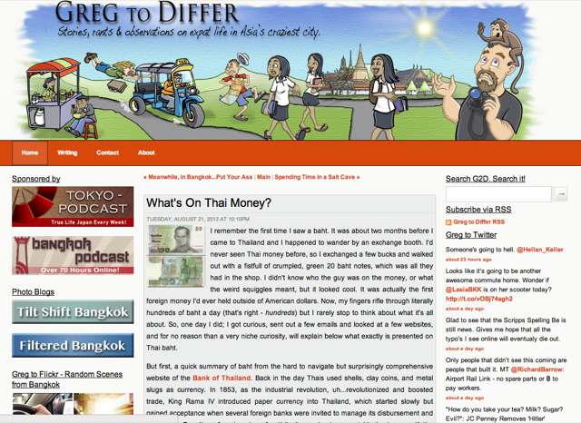
This was the next iteration, on WordPress. New layout, new cartoon header.
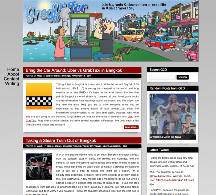
I got bored with that after a few years, and updated things a bit. More modern theme, more options for layout, etc.
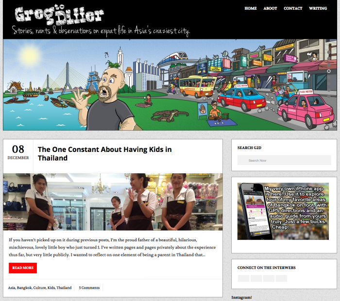
So there you have it. Finally, a comprehensive look at my previous blog designs, as the masses requested. Well, at least it serves as a nice bookmark in the typewritten river of posts that clog up my hard drive. I hope to post more in the future…but then again, I always say that.
See you then.


Leave A Comment